Quick Answer
Minimalist Mahjong design replaces ornament-heavy tile faces with modern typography, simplified iconography, stronger spacing, and more controlled color systems. The result can feel more premium, more readable, and more accessible to new players without changing the core rules or tile function.
The Shift from Ornamental to Intentional
For decades, American Mahjong tile design leaned on ornate calligraphy, decorative flower tiles, and detailed dragon motifs. That visual language honored the game’s history, but a different aesthetic has grown quickly in the 2020s: cleaner geometry, simplified marks, restrained palettes, and typography that looks closer to product design than ornament.
This shift mirrors broader premium consumer trends. As more adults discover tabletop games through design-led retail, lifestyle photography, and social media, they expect leisure products to feel as considered as home decor, personal accessories, and gift packaging.
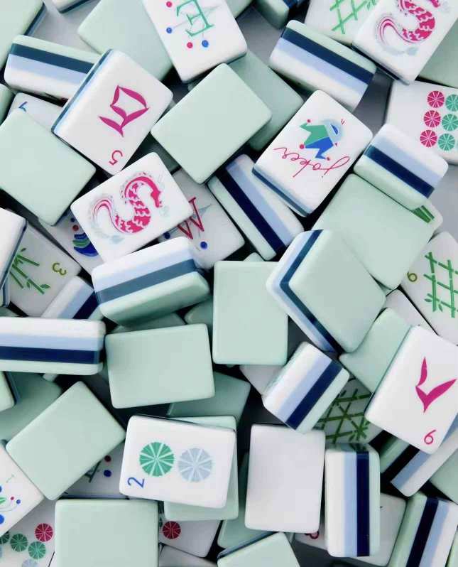
What Minimalist Mahjong Actually Looks Like
Minimalism in Mahjong does not remove information. A standard American Mahjong set still needs the same functional system: suits, winds, dragons, flowers, jokers, and the tile count required for play. What changes is how that information is rendered.
Typography
Traditional numerals and marks give way to geometric sans-serifs, monospaced figures, and more disciplined alignment. The tile face reads faster because the type feels structured instead of decorative.
Iconography
Minimalist sets often simplify winds, dragons, and suit symbols into cleaner forms with fewer strokes. Good icon reduction keeps recognition immediate while reducing visual noise.
Negative Space
Spacing becomes part of the design system. Instead of filling every part of the tile face, minimalist layouts leave more breathing room so the key mark stands out from normal playing distance.
Monochromatic or Controlled Color Use
Many minimalist sets avoid a busy mix of engraving colors. Black, gold, white, or a single dark tonal fill can make the set feel more coherent when all 166 tiles are viewed together.
Why Minimalism Works for American Mahjong
There is an aesthetic reason minimalist Mahjong appeals to modern buyers, but there is also a practical one. American Mahjong is a scanning game. Players repeatedly assess their rack, read discards, and process suit or pattern changes under light time pressure.
When tiles carry only the essential visual information, recognition can become faster. Cleaner character forms also improve readability from across the table, which matters in normal four-player setups.
Minimalist design can also lower the barrier for newer players who are not yet familiar with traditional Chinese character forms. Abstract but well-structured symbols and clearer typography help them orient faster during early games.
The Design Tension: Tradition vs. Modernity
Minimalist Mahjong inevitably raises a design question: how far can a set simplify before it loses the cultural and visual references that make Mahjong feel like Mahjong?
The strongest answer is not total reduction. It is informed minimalism. A flower tile can still reference botanical art, but through a single-line illustration instead of a dense painting. A dragon tile can still carry traditional color logic while using a more contemporary visual form.
This balance lets a product feel modern without flattening the game’s heritage into generic tabletop branding.
Why Manufacturing Precision Matters More in Minimalist Sets
Minimalist designs often look simpler, but premium execution is usually less forgiving. When a tile face uses clean alignment, tight spacing, and a controlled palette, even small engraving drift or color inconsistency becomes obvious.
That is why many premium minimalist projects need stronger sample review, alignment control, and material consistency than a more ornamental set where dense graphics hide small production variation.
Three Questions About Minimalist Mahjong Design
Will experienced Mahjong players accept minimalist tile designs, or is there resistance?
Most players adapt quickly as long as readability remains strong. Resistance usually comes from weak execution, not from minimalism itself. If contrast, line weight, or icon clarity are compromised, experienced players notice immediately.
Do minimalist Mahjong sets cost more or less than traditional designs?
At the premium end, minimalist sets often cost slightly more. Cleaner visuals demand tighter engraving quality, better alignment, and materials that can support a more exposed design language without obvious flaws.
Can I request a minimalist redesign of a traditional set through custom OEM manufacturing?
Yes. A custom OEM workflow can adapt typography, iconography, tile backs, color systems, and packaging into a minimalist direction. The best starting point is a reference set of preferred fonts, symbols, color targets, and sample-level expectations.
Share your preferred typography direction, icon references, color palette, and packaging goals. Lucky Mahjong can help turn a modern aesthetic concept into a production-ready American Mahjong specification.
Discuss a Custom Mahjong Project