Quick Answer
Pastel palettes usually feel softer, more giftable, and more lifestyle-oriented, while bold palettes create stronger recognition and more visual impact. The best choice depends on the buyer, the room context, the photography style, and whether the brand wants broad appeal or a sharper signature identity.
Color Is Often the Core Brand Signal
In a market where National Mah Jongg League oriented set formats are already familiar to players, the fastest way a brand becomes recognizable is usually through color. Buyers may not remember the tile thickness or insert card language first, but they will remember the palette they saw on a table, in a boutique display, or in a social post.
That is why colorway decisions deserve the same level of discipline as packaging and logo design. For many lifestyle-led Mahjong brands, the palette is not a finishing detail. It is the product identity.
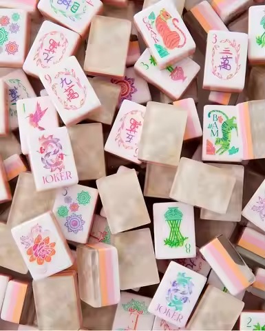
The Pastel Approach: Soft Power That Sells Easily
Pastel palettes remain dominant because they align with broader home decor, gifting, and tabletop styling trends. Blush pink, sage, powder blue, lavender, cream, and champagne all photograph cleanly under natural light and usually feel compatible with a wider range of interiors.
That soft presentation matters in a category where buyers often discover products through visual channels first. Pastel sets can read more like a premium lifestyle object than a traditional game set, which helps them work for gift buyers, boutique retail, and event-driven merchandising.
Why Pastels Work
- They are easy to style in bright editorial photography.
- They fit home decor and gifting use cases naturally.
- They tend to feel approachable for first-time or occasional buyers.
The Main Pastel Risk
Pastels can become interchangeable when the shades are too generic. A soft green or blush launch only feels brand-ownable when the exact hue, finish, engraving contrast, and packaging details are clearly intentional.
The Bold Approach: Strong Recognition and Stronger Reactions
Bold palettes such as cobalt, emerald, ruby, citrus, or deep black can stand apart quickly in a market crowded with soft neutrals. They are often easier to remember, especially in lower-light entertaining spaces where pale tiles may lose some of their visual energy.
For a new Mahjong brand that wants a sharper position, bold can be more defensible. It is easier for the market to remember “the cobalt Mahjong set” than another light blue product with minor packaging differences.
Why Bold Works
- It creates immediate table presence.
- It is easier to anchor a signature look around one hero color.
- It tends to read strongly in evening hosting, game-room, and event settings.
The Main Bold Risk
Bold palettes are more polarizing. The buyer who loves the color may love it intensely, but another buyer may reject it completely. That can make assortment planning more challenging for boutiques that need broader sell-through.
When using bold tile colors, neutral accessories often help. Cream, linen, sand, or light leather tones can keep the set feeling premium instead of visually overloaded.
A Third Direction: Multi-Tone and Gradient Systems
Some modern brands move beyond the pastel-versus-bold split by assigning coordinated tonal variation across the set. Different suits may use light, medium, and deep shades of the same family, creating variety without losing cohesion.
This can also improve usability. When tones are planned well, players may distinguish suits faster at rack distance while the set still reads as one controlled design system.
Production Reality: Color Consistency Matters More Than the Palette Itself
No matter which direction you choose, consistency across the full tile run is the real quality test. American Mahjong projects often require 152, 160, or 166-tile configurations depending on the product requirements, and even small color variation becomes visible when tiles are grouped together.
For premium acrylic projects, buyers should confirm how color matching will be reviewed, how approval samples will be checked under lighting, and how finish choices affect the final look. Gloss, edge polish, engraving fill, and surrounding accessory materials all influence whether the chosen palette feels premium in person.
If a color is central to the brand, request a controlled color review step before full production. A strong concept on screen can shift noticeably once material, finish, and engraving are finalized.
Three Common Questions Brand Founders Ask
How many colorways should I launch with?
Usually two or three are enough. One broadly appealing option, one signature statement color, and optionally one limited or seasonal direction gives the brand range without diluting recognition.
Should engraving color match or contrast the tile body?
Contrast is usually the better choice for playability. Pale fill on darker tiles and darker fill on light tiles tends to improve readability from normal playing distance.
How do I stop competitors from copying my signature color?
Color alone is rarely enough. The more defensible strategy is to build a full design language around the palette: tile artwork, engraving style, packaging, trim color, inserts, and merchandising voice should all reinforce the same identity.
Share your target buyer, preferred palette direction, packaging references, and customization scope. Lucky Mahjong can help you discuss practical tile, accessory, and packaging combinations for a custom project.
Discuss a Custom Mahjong Project