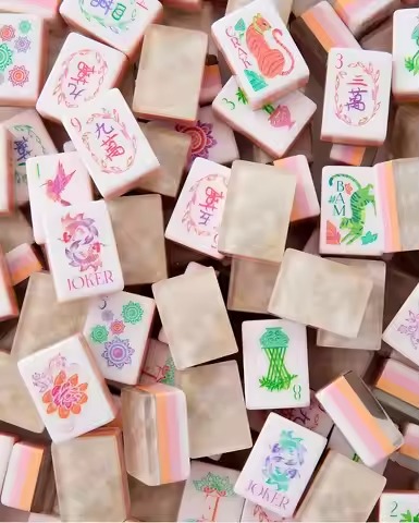
When a player opens a gift box, joins a Mahjong club, or first sees a lifestyle photo, color does a large share of the branding work before anyone studies tile count or material. It shapes the perceived style, retail fit, and personality of the set almost instantly.
That is why brands choosing colors for tiles, jokers, mats, accessories, and packaging should treat palette planning as a product decision, not a cosmetic afterthought.
The 2026 Mahjong Color Landscape
Pastel Palettes
Blush pink, lavender, mint green, pastel yellow, baby blue, and peach continue to perform well for giftable, boutique, and lifestyle-led collections. These colorways tend to photograph cleanly and feel approachable for newer buyers.
Botanical and Natural Tones
Sage, olive, warm ivory, terracotta, deep forest, and stone grey support a calmer aesthetic that works well for heritage, home-friendly, and boutique-oriented positioning. These tones often pair naturally with classic packaging and quieter merchandising.
Bold and High-Contrast Directions
Bright orange, deep red, black-and-white, and graphic multi-color combinations create a faster visual impact. This direction is useful when a set is meant to feel statement-making, seasonal, or especially social-media-friendly.
Clear and Layered Acrylic
Transparent, semi-transparent, pearlized, and layered acrylic constructions continue to signal premium positioning. In these projects, color is inseparable from light, depth, and the way the tile interacts with different mats and room conditions.
Monochrome and Minimalist Systems
White, black, cream, silver, grey, and tonal systems still attract design-conscious buyers. The challenge is keeping the set readable enough for real play instead of letting the palette become too subtle.
How to Choose a Palette for Your Brand
| Customer Profile | Suggested Palette Direction | Material Direction |
|---|---|---|
| Gift or lifestyle boutique | Pastel or soft seasonal palette | Acrylic or layered acrylic |
| Heritage or premium brand | Botanical, tortoise-inspired, or clear acrylic | Acrylic or premium layered acrylic |
| Social media brand | Bold, high-contrast, or photogenic colors | Acrylic |
| Club or group supplier | Readable classic colors | Melamine or acrylic |
| Travel or casual brand | Bright, practical colors | Acrylic or compact construction |
Plan the Full Collection, Not Just the Tiles
A strong collection palette should cover more than the face color of the tiles. Buyers usually experience the set as a coordinated system, so the brand should define:
- Primary tile color
- Tile back color
- Joker accent colors
- Mat color and contrast
- Packaging color and finish
- Rack, pusher, bag, and insert card coordination
This is where many launches either become memorable or generic. A clear color strategy across components gives the set a stronger identity than a nice tile color alone.
Test Color Combinations Before Approval
Digital mockups help directionally, but they are not enough for approval. Brands should test the same color concept across the main usage contexts:
- Tiles on mat: confirm that suits stay readable and do not visually disappear.
- Tiles in packaging: make sure the gift box or storage format supports the intended mood.
- Tiles in natural light: check whether the color shifts warmer, cooler, flatter, or more vivid than expected.
- Accessories together: confirm that racks, pushers, bags, and inserts feel coordinated rather than assembled from separate ideas.
How Material Changes the Color Result
| Material | Typical Color Behavior | Buyer Note |
|---|---|---|
| Acrylic | Often vivid, glossy, and visually crisp | Good fit for gift, boutique, and premium collections |
| Layered acrylic | Shows depth and dimensional shifts | Needs careful sampling under different light |
| Melamine | Often more classic or matte in appearance | Can be practical for group-use and club-focused sets |
| Mat fabric or neoprene | Can soften or slightly shift printed colors | Mat choice should be tested with the actual tiles |
| Packaging print | Depends on paper stock and finish | Printed packaging can look warmer or flatter than tile samples |
Seasonality Still Matters
Many brands now use seasonal or limited-edition color stories to match buying cycles. Spring pastels, summer brights, warm holiday tones, and event-specific palettes can create fresh merchandising angles and repeated social content.
Core collections should stay stable enough for reorder confidence, while limited colors can create urgency without making the full assortment feel inconsistent.
Color Direction Summary
| Direction | Best For | Buyer Note |
|---|---|---|
| Pastel | Gift, lifestyle, and social-first collections | High visual appeal for consumer-facing launches |
| Botanical | Heritage, luxury, and calm retail styling | Works well with quieter packaging and boutique presentation |
| Bold/contrast | Trend brands and limited editions | Useful when the set needs quick recognition |
| Clear/layered | Premium gifts and higher-end collections | Sampling is essential to confirm clarity and color accuracy |
| Monochrome | Minimalist and design-conscious buyers | Best when readability remains strong |
FAQ
What are strong Mahjong tile color directions in 2026?
Pastels, botanical tones, bold high-contrast colors, clear or layered acrylic effects, and minimalist palettes are all useful directions. The right choice depends on buyer segment, retail positioning, material, packaging, and whether the set is for gifts, clubs, boutiques, or private label collections.
How do I choose a color palette for my Mahjong brand?
Start by identifying your target customer and product scope. Gift and lifestyle boutiques may prefer pastels. Premium brands may prefer botanical, tortoise-inspired, or clear acrylic directions. Club suppliers may prefer durable, readable colors. Always test color combinations with physical samples before finalizing.
Can I get custom colors for my Mahjong tiles?
Yes. Lucky Mahjong can support custom tile colors for private label and boutique brands depending on project scope and production feasibility. Buyers can discuss tile face color, tile back color, joker colors, mat colors, and packaging colors. Color matching is confirmed during sampling.
Do pastel Mahjong tiles show dirt more easily?
Pastel tiles may show handling marks more visibly than darker colors. Care instructions should be confirmed based on material and surface finish. For high-use club sets, darker colors or melamine tiles may be more practical. For gift and display sets, pastels can work well when care expectations are clear.
What color mat should I use with my tile set?
Use a mat color that improves contrast and supports the brand story. Pastel tiles often benefit from darker or more neutral mats, while bold tiles may need a quieter mat. Clear acrylic tiles should be tested on several mat colors before final approval.
How do seasonal color trends affect Mahjong design?
Seasonal color planning can help brands create gift, holiday, wedding, or event-focused collections. Limited-edition palettes can create fresh content, while core colors should remain stable enough for repeat orders and wholesale planning.
Next Steps for Buyers
If you already have a brand palette in mind, the fastest next step is to define your target customer, preferred material, and whether you need coordination across tiles, mats, bags, and packaging. That makes sampling much more useful and avoids expensive revisions later.